UX Case Study
I conducted research and developed UX/UI designs for StarFlight Australia, an organisation that provides aviation solutions for government agencies and private sector companies. The website was targeted at (1) tender application receivers and (2) leads who have come across StarFlight at trade-shows, events and word-of-mouth.
My role: UX/UI Designer and Researcher
Prototypes and research can be provided upon request.

The problem
The original site was not responsive, was not targeted to specific users nor showcased the incredible aeromedical capability of the organisation.
The goal
The new responsive website would showcase the full scope of the organisation and remove pain-points for the main user groups.
Research
Due to the inability to access users for research, interviews were conducted with several internal stakeholders who have the most contact with them. The two main user groups that came from the research were (1) the receivers of tender applications and (2) warm leads from trade shows and other events.
User Group 1: Tender Application Receivers
These users investigate StarFlight to legitimize the tender proposal, business and services. They want to get an overall sense of who StarFlight is, what else StarFlight can do and see examples to validate the information they received in the application.
"Your website should be a tool to legitimize your business and services and validate the information in your application. I want to see the website and go ‘they are a good fit for the contract’."
User Group 2: Warm Leads
These users came across StarFlight from a tradeshow/event/word of mouth and wants to learn more about what StarFlight can do, in relation to specific services. They have an actual requirement for services StarFlight offers and may want to request a proposal.
"My business/organisation has a specific need for a service that I hear you provide. I would like to talk more about what you could do for us."
User pain points
1.
Unclear brand identity
The branding and design did not portray the full scope of the organisation nor convey that StarFlight is a leader in the industry providing cutting-edge aviation solutions.
2.
Poor navigation
The site navigation made it difficult to explore any secondary pages. There was also no search functionality, which is what the tender receivers needed most to quickly search the site for information relevant to the tender.
3.
Unresponsive on mobile
The site was not fully optimised for mobile, which was detrimental to the experience for the leads from tradeshows who would be viewing the site on mobile.
4.
Lack of clear and easy to read content
Taking more time on an applicant’s website because the content is not clearly organised was a significant pain point for the first user group. The second user group also found this a pain point as they are in search of information on specific services.
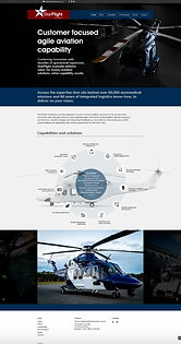
Starting the design
I started the design work with competitor research looking at websites from a variety of industries that showcased 'excellence'. Common themes carried over from site to site were large, powerful imagery, bold colours and interesting shapes.
Taking on the learnings from that research, I developed prototypes (starting with low-fidelity and moving to high-fidelity) that addressed the pain points and showcased the aeromedical 'excellence' of the brand through shapes that draw parallels with the shapes found on aircraft.
At the end of the project, the website addressed all four pain points:
1. A clearer brand identity
2. Improved navigation with drop-downs and a search function
3. Pages that were both visually appealing and responsive on desktop and mobile
4. Clearer content organisation and visualisation

Limitations and Takeways
If I had had the opportunity, I would have liked to have completed more comprehensive research as well as usability studies prior to development. This would have helped deliver designs that I knew were proven 'good experiences'. However, despite the project limitations, I still learnt a great deal about UX/UI design and empathising with the user.