UX Case Study
I conducted research and developed UX/UI designs of a website for Down the Road, which allows users to easily find local businesses and support them either by visiting them in-person or buying their products online. The website was targeted at (1) environmental and social activists who prefer to shop locally and (2) trendy gift givers.
My role: UX/UI Designer, Researcher and Brand Designer

The problem
Users needed to be able to find and buy from small local stores and sellers of goods that aren't connected to big store chains, appealing to the 'buy local' sustainability trend.
The goal
The responsive website for Down the Road will let users find local stores and ‘sellers’ easily, which will affect users who are wanting to buy something unique and trendy or wanting to buy locally for social and environmental reasons.
Research
Interviews were conducted with 4 users who met the criteria of preferring to shop locally. Prior to research, it was assumed that the main user groups would be of an older demographic with an unintentionally lower digital literacy. However, this was not the case. The two main user groups that came from the research were (1) social and environmental activists and (2) trendy gift buyers.
User pain points
1.
Online shops and big store chains dominate search results
When searching on Google, the top results are often online stores due to advertising or big store chains despite searching a query about their local area.
2.
Difficulty finding local ‘sellers’ that may not have an easily searchable store e.g. local produce
It is often difficult finding local sellers of handmade items and fresh produce when they don’t have websites themselves. There are other competitors on the market such as Etsy but these competitors only allow users to purchase products online.
3.
Research is across multiple platforms and channels
Finding local stores often involves coming across them on social media, search engines, word of mouth and physically seeing the stores.
Persona: De-anne
De-anne is an environmental and social activist at heart who needs to support local businesses wherever they can because they worry about their carbon footprint and the economy of their local community, especially after the pandemic.

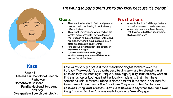
Persona: Kate
Kate is a user who likes following trends who needs to be able to find shops from which they can buy locally-made gifts because buying ‘local’ is fashionable.

Starting the design
Over the course of the design process, the end users' needs were kept top of mind. The process included paper wireframes iterating on all of the main pages of the website, then digital wireframes, low-fidelity prototypes and then high-fidelity prototypes.
Paper wireframes
During the paper wireframing process, I wanted to ensure that I was keeping the users’ needs top of mind. This included focusing on search options first due to both user journeys starting with search and also considering a filter functionality to make it easier for the De-anne persona to find environmentally or locally sourced products.

Digital wireframes and low-fidelity prototype
The digital wireframes and then the low-fidelity prototype were developed from the paper wireframes keeping in mind the two main user groups who would be using the app: (1) social and environmental activists who prefer to support local stores and (2) trendy gift givers. For example, a search functionality was created that allows users to enter multiple keywords with the elements beneath adaptively updating. This helps both the trendy gift giver persona who is looking for convenience and the activist persona who needs to be able to find truly local businesses that offer Australian or locally-made products.

Usability study
A moderated usability study on the low-fidelity prototype was conducted on 3 users. A number of findings came from the study and influenced the eventual creation of the high-fidelity prototype. The findings include:
-
Users weren’t aware that there was a ‘stores and sellers’ section on the homepage. This made the website not user friendly to the environmental and social activist persona who are visiting the site to find local stores.
-
Users found it difficult to understand how the homepage search box would be implemented and used.
-
The ‘stores and sellers’ page is too similar to the products page and does not effectively showcase how ‘local’ the stores are.
-
The main ‘stores and sellers’ and ‘shop’ navigation items did not stand out enough to the user.
-
Users wanted to be able to complete more research on stores before visiting.

High-fidelity prototype
The high-fidelity prototype was created after the usability study. It met the user needs to easily find local stores and sellers and support them through getting directions to visit in store or purchase their products online.
Accessibility considerations:
Several considerations were included in the prototype including:
-
Using clear hierarchical headings to help users easily navigate the website.
-
No instances of text on imagery was used to reduce the impact of visibility issues.
-
All instances of text colours passed visibility checkers for both normal text, large text and UI components.

Takeaways
During this project, I reaffirmed my knowledge in user experiences best practices and making user-centric designs. Starting the design process with user research, spending time and effort on the low-fidelity prototype first and conducting a usability study helped me achieve that.